Our clients rely on Brenner Photo Productions to support marketing campaigns and site updates with high quality and original imagery.
They spend the time to prepare shot lists, ship product or art direct on set and of course make the investment in great visual content. So after the exceptional shooting experience and final file delivery and download, then what? We are here to explain where to use what files and when. Surprisingly, we often come across websites and print advertisements that are misusing color profiles and file formats. When incorrect files are used in the wrong platforms the image quality and colors are significantly affected.
We typically delivery files in Lo Res sRGB jpg, Hi Res RGB tif and Hi Res CMYK tif.
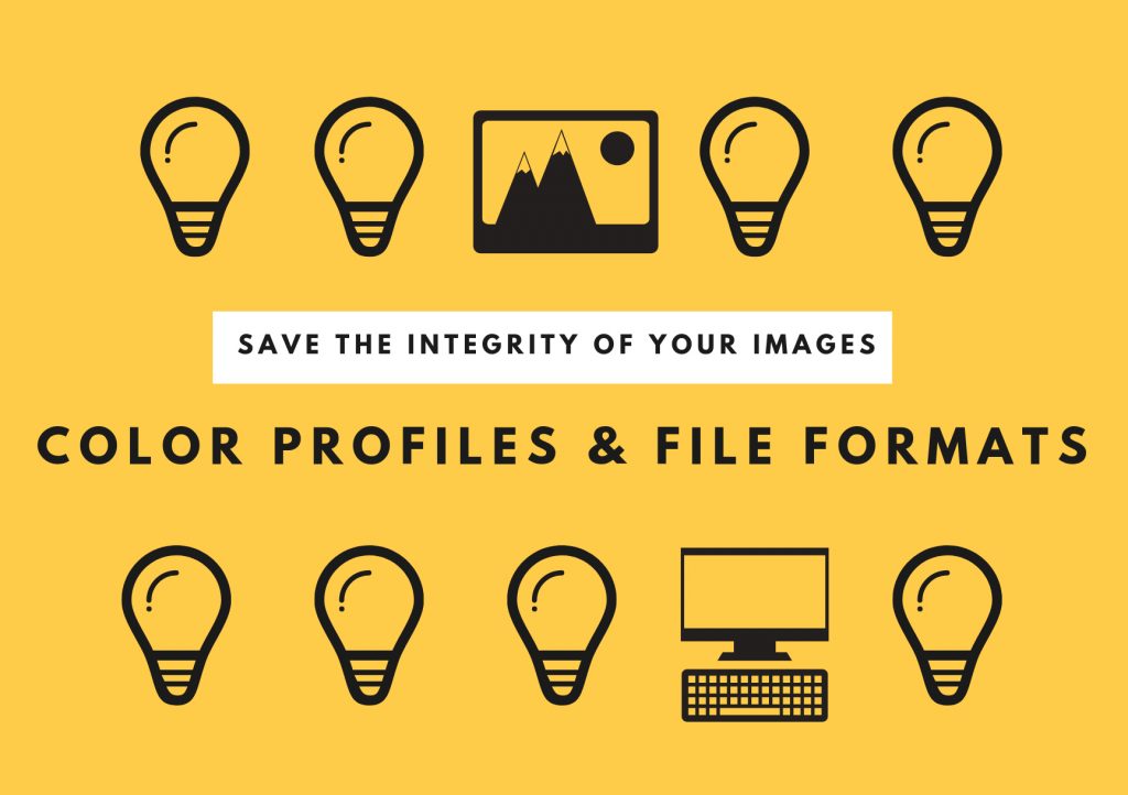
The right type of file for the right type of media. Each file has a color profile attached to it. What does this mean to you? Depending on where the image will be used depends on the correct file.
What is a color profile? It is a set of data that characterizes the color space of an actual device like a camera, or is imbedded within a file to define the color space and gamut of the image to ensure its viewed correctly on the website and then redisplays correctly on other devices. To clarify, color profile and color space are one in the same…


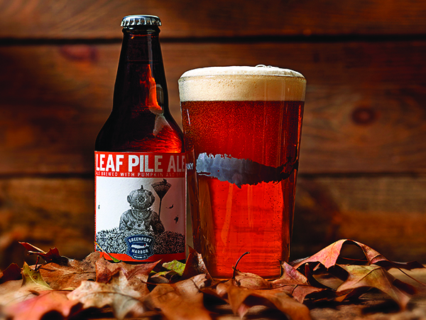
Correct file to use online

Incorrect file to use online
Lo Res sRGB jpg files are used for websites, and digital presentations because monitors use the sRGB color profiles. Visually, it’s brighter colors than CMYK. However, it’s a smaller gamut than Adobe RGB.
Hi Res RGB tif files can be used as a starting point or an archive file that can be edited for all applications.
Hi Res CMYK tif files are used strictly for 4 color lithograph printers in magazines, newspapers, and alternative varieties of flyers. It conjointly has the foremost restricted quantity of colors it will reproduce, it tends to own abundant duller colors.
Size Matters…Hi Resolution vs. Low Resolution
Hi Res files are used for printing and for some “zoom-in” features on websites. If a person decided to print the Lo Res File it will look like the example on the right below, pixelated and blurry. If you are printing on a 4 color lithograph system as example a Heidelberg press you will need to use the CMYK file also make sure it is a 300dpi file. DPI or “dots per inch” and PPI which stands for “pixels per inch” are units of measurement. These measurements define the pixel density which determines what application your file is appropriate for. Websites present images at a low resolution of 72dpi. Even at that size images will look sharp and fresh on the web. For print however, images should be no less than 300 dpi.
Hubspot makes an excellent point that anyone utilizing imagery should take to heart. “Don’t try to trick the system. A lot of magic can happen in Photoshop, but creating pixels out of thin air isn’t one of them. Pulling an image off of the web and trying to get it to fit the dimensions of your print project just won’t work. You will end up with a pixelated image that appears stretched and distorted.”

Example of a 300 DPI File Print

Example of a 72 DPI File Print
As a result choosing the correct file for the right application is important. Using the wrong file could result in color loss and/or over saturation of the colors of an image. Follow the above guidelines to maintain the integrity and quality of your valuable images. And as always, BPP is here to help. Our staff and digital team is always available to answer any questions and work with you, your web team and/or printer to ensure the perfect image journey from capture to usage. Look out for our next blog in the Back to Basics series: Image File Extensions and When to Use Them.